Brand Design System . Restaurant type.
︎ ARTISTIC DIRECTION : Photography . Editorial
. Graphic Design . Packaging design .
︎ COMMISSION : Vamolà, Bologna (ITA) . 2015
Brand Design System . Restaurant type.
︎ ARTISTIC DIRECTION : Photography . Editorial
. Graphic Design . Packaging design .
︎ COMMISSION : Vamolà, Bologna (ITA) . 2015
︎ ARTISTIC DIRECTION : Photography . Editorial
. Graphic Design . Packaging design .
︎ COMMISSION : Vamolà, Bologna (ITA) . 2015
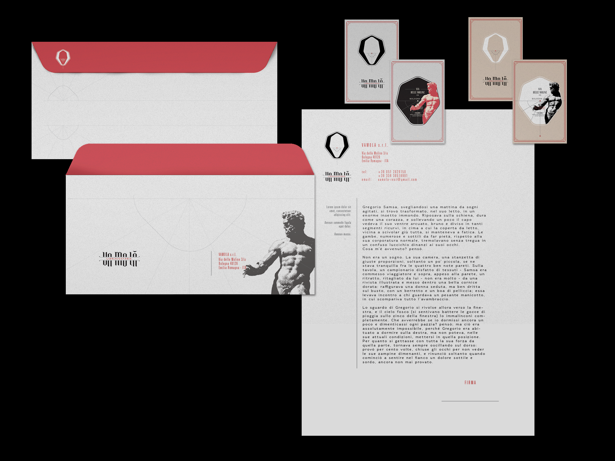
Vamolà
Branding2014 — 2015 ︎ (ITA)
(︎)
“Vamolà", in Bologna’s dialect, means “to go there“. But also let’s go, or check it out.
Saw the nature and the concept of the restaurant, with traditional dishes from the emilian and bolognese’s culinary tradition, it was important for the client to show references with the city and the gastronomic and enologic heritage of the area.
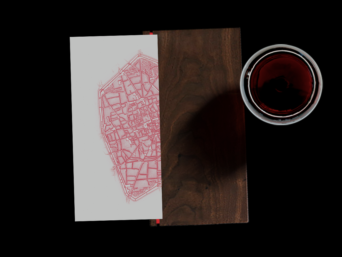
The interiors of the place, obtained by the restoration of an old library running from the 20s, maintained a vintage look, and so, should have been the communication.
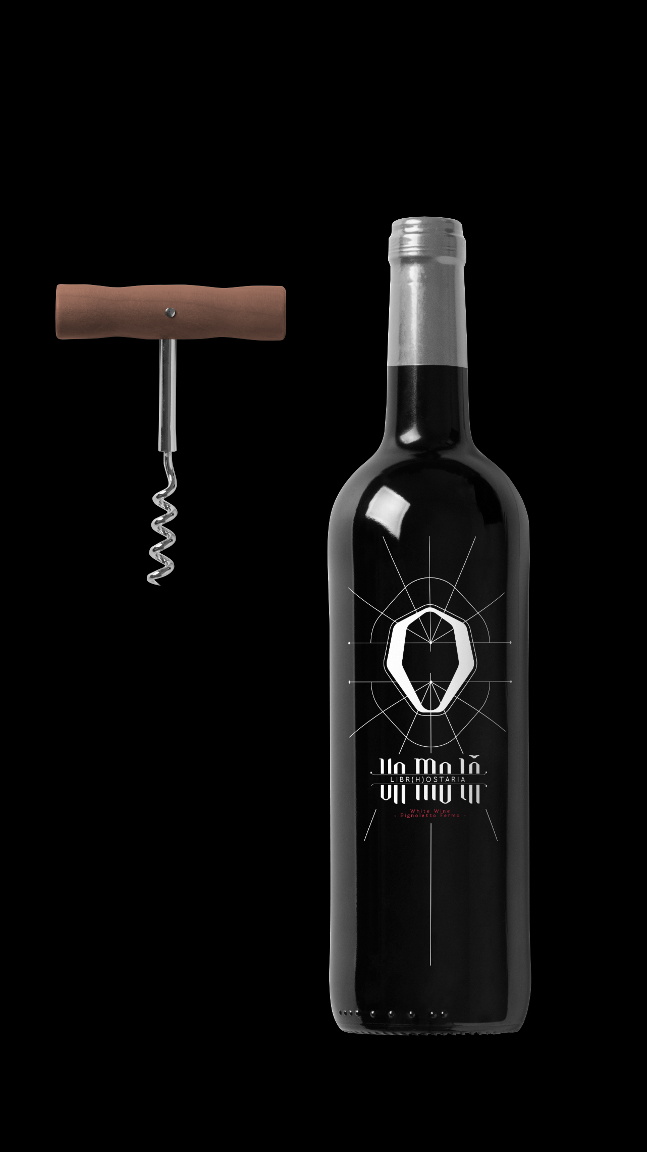
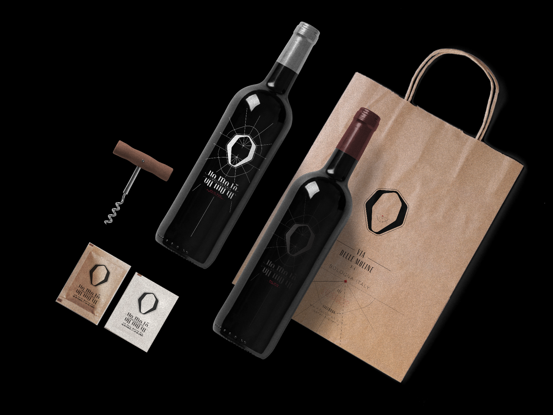
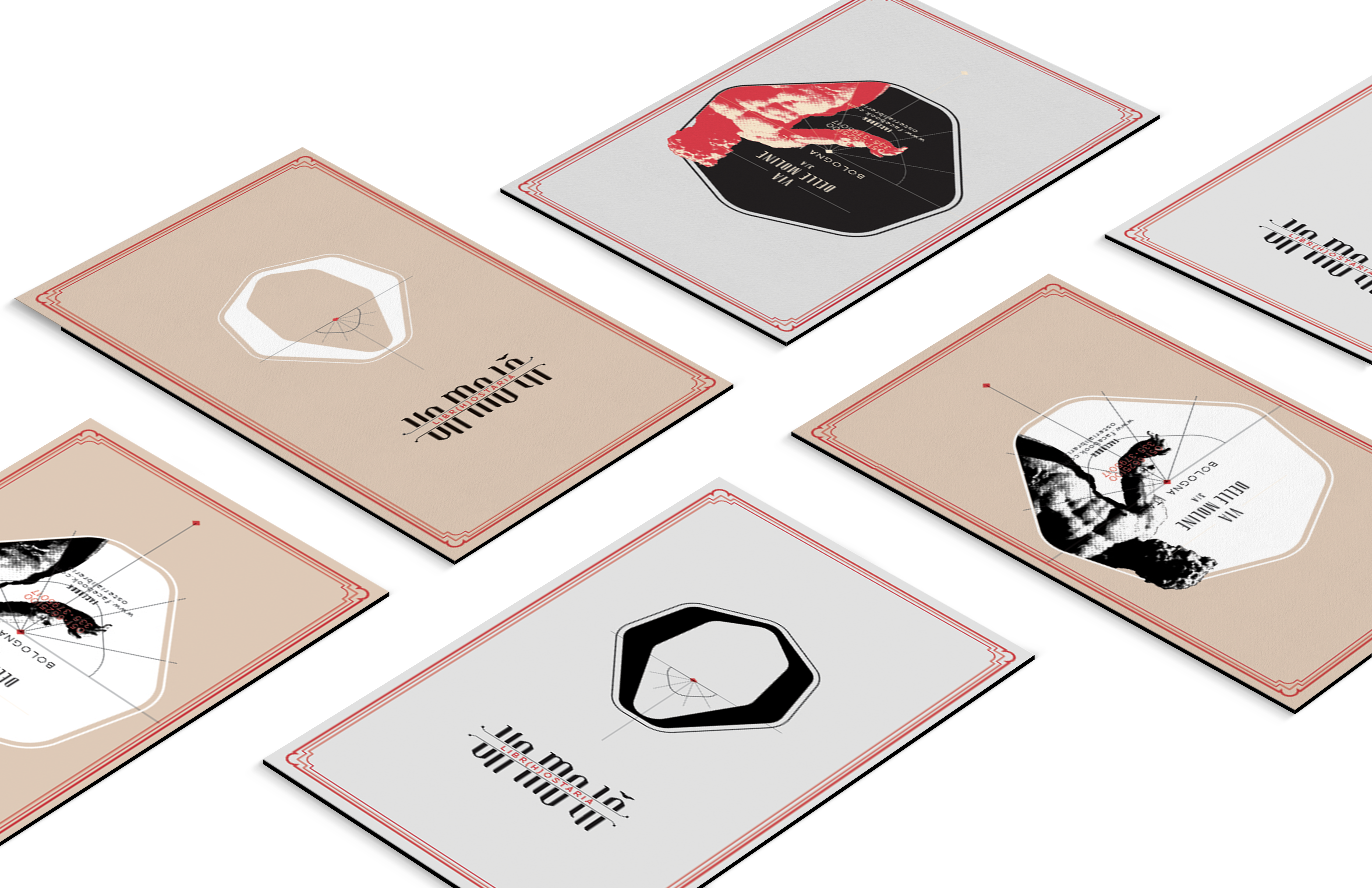
The logo has been created after the shape of the ancient fortification that included the city center area. For the logotype it has been choosen a type that could nicely look alike a type of the 20s.
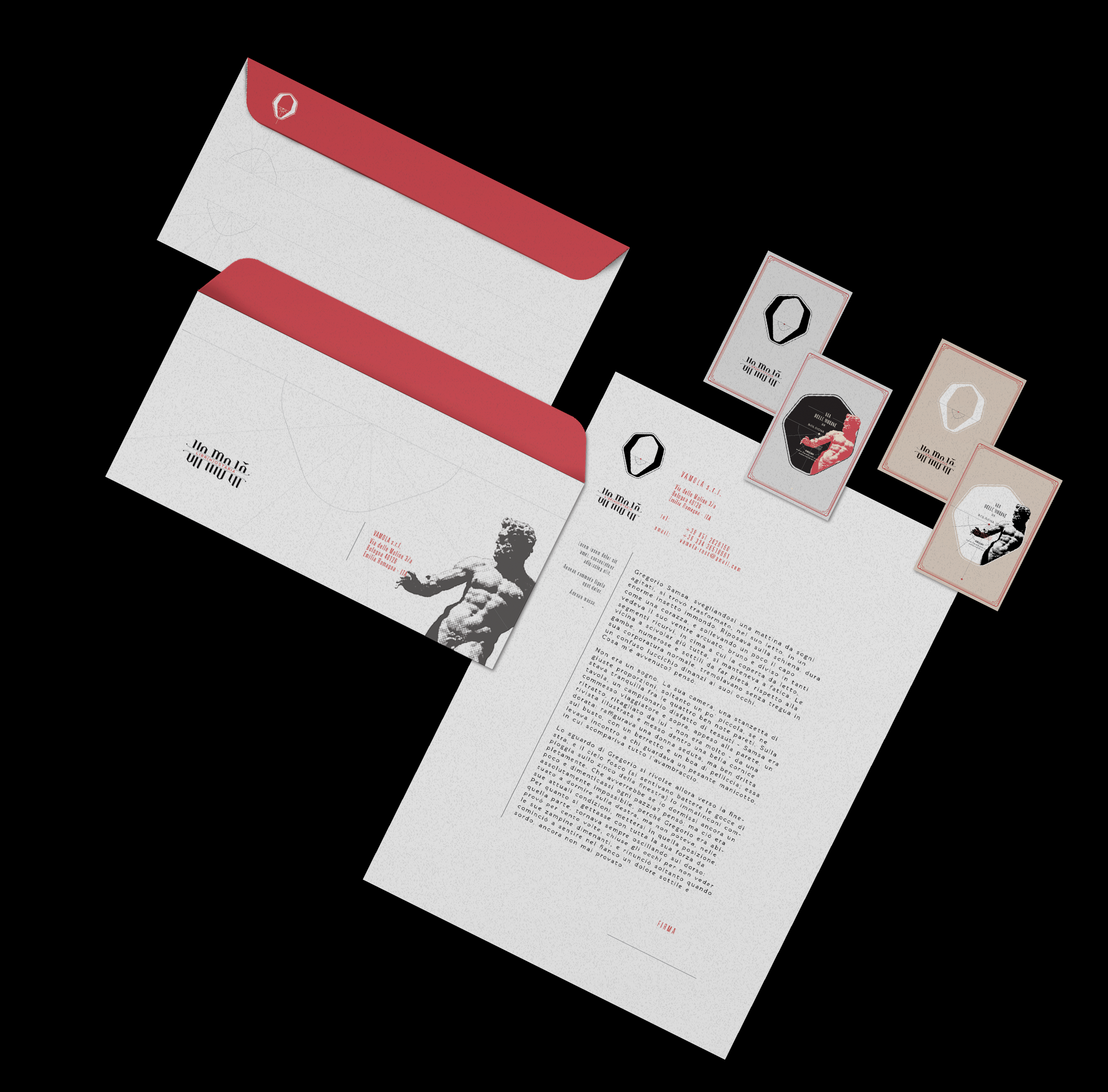
// BRAND DESIGN :
Business card, Paper, envelope
// XTRA BRAND :
Menu, tablecloath, coaster, various packaging


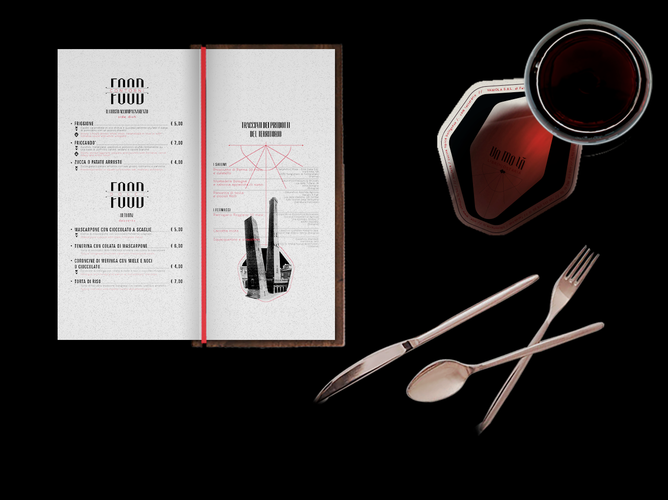

// Menu dex :
mm 257 x 132 h
elastic band ; laserjet print ;
31 pgs ; Fabriano white,
coated Paper
// Inside :
mm 132 x 73 h
Fabriano white coated
︎ Vamola
︎view full menu here.